Quite The Character. Because He Lacked It.

Curtis Howe Springer was a self-proclaimed medical doctor and Methodist minister, though he was licensed for neither.

A popular radio evangelist, Curtis Springer eventually “created” space in California’s Mojave Desert dubbing his settlement, the “spa,” and the ensuing miracle cure products “Zzyzx” (pronounced, according to his products, “zi-zix”) as a gimmick to ensure that the brand would be “the last word” in health.

He called himself “the last of the old-time medicine men”- the American Medical Association called him “the King of Quacks” in 1969.

A few years later, he & his cult-like followers would be called out for squatting – swapping Federal lands for government prison.

Sharing this because I have a fascination for medical quackery… And I’ve just listed an empty can of Zzyzx for a friend on eBay – and all this research can-not go to waste!

For posterity, B-Plus was a “scientific blend” of “delicious basic foods in a dry or dehydrated form.” Which, according to the can’s wrapper was “the bulk equivalent of 1,000 Ten Grain tablets.” This is important, because the Springers believed “certain values” were “lost in the compression of tablets.”

Can features a number of graphics, including images of Curtis & his second wife, Helen, and the Zzyzx Mineral Springs and Health Resort.

This old advertising tin of medical quackery stands approximately 5 1/2 inches tall, 4 inches in diameter.

A “Helen Springer Product, Basic Food Products, Baker, California.”

More info at Atlas Obscura & Wiki.

Vintage Marketing To Women Was A-Wash In Premiums

Some people think that the only premiums that came in boxes were in cereal boxes for kids. Sure, there were those coupon books and other early loyalty programs designed to bring people back to certain department stores, gas stations, grocery stores, and other shops. But when it comes to actual free things inside boxes, most people think of the toys and surprises inside cereal boxes designed to make the kiddies beg mom and dad for the stuff. But there were other premiums, including those in products for adults. And primarily these offers were specifically aimed at those adults in charge of most household purchasing: the American housewife.

white wash no red hands vintage duz adPerhaps nowhere was this push for premiums more used than in the area of laundry detergents and soaps.

The competition was fierce in this market on all sorts of points, just as it is today, on everything from cleaning power and amount of suds (any real expert will tell you cleaning has more to do with physical scrubbing and agitation than chemicals and soap suds) to product versatility, and, because some cleaning still was done by actual human hands (something I still highly recommend), how gentle the product was on the little lady’s hands.

Those of us who are at least 40 years old may vividly recall these premiums and brands — not coincidentally because of the soap operas, which were, at their very essence, dramas created for housewives to watch and therefore pushed soaps and cleaning products; hence the name soap operas.

Lever Brothers, makers of Breeze laundry soap, partnered with Cannon towels for a luxury co-branded premium giveaway, eventually offering three sizes of towels.

breezead

three sizes of vintage cannon towels in breeze detergent

(This stuff is apparently so nostalgic, that someone just paid $39.99 for an old unopened box of Breeze with the towel still inside.)

My mom watched the CBS soap operas, as did her mother before her. As a result, our family was loyal to the family of Proctor & Gamble products. Proctor & Gamble put towels into their boxes of Bonus laundry detergent — as this fabulous musical commercial from 1960s illustrates. Note the gender split — and how the little woman’s knowledge (and sexual necktie manipulation) wins out.

Later, P&G would graduate from towels to putting glasses and china dishes with a wheat pattern (some even with gold trim) in boxes of Duz, the “does everything” laundry detergent. Incidentally, those wheat dishes were once clogging thrift shop shelves, but now, nostalgia coupled with the fascination with Mid-Century Modern, these dishes are making a comeback.

However, when it comes laundry detergent premiums, I don’t think many things are so firmly entrenched in our collective minds as Dolly Parton pitching boxes of soap with towels in them in the 1970s. While there is some debate as to whether the brand of detergent was Breeze or Duz (it was, in fact, Breeze; and we pray again to the YouTube Gods that someone can upload such a commercial!), almost everyone recalls the ads. Especially the kitsch factor.

Dolly herself admits how corny the ads were:

I remember seeing you on “The Porter Wagoner Show,” pulling out giant towels from boxes of Breeze detergent.

It was actually a bath towel — we used to have to do our own commercials on those shows, and they were so corny. But I still have some of those towels that I’ve kept through the years. Those were the days — “And you can only get them in boxes of Breeze!” And honestly, with that towel inside, there probably wasn’t more than half a box of Breeze. But people didn’t care because they were getting something free.

Corny or not, to this day, when I see a small hand towel covered in gold roses, “zeenyas!”, or other yellow flowers I instantly think of Dolly Parton. Its not just Dolly’s love of yellow roses, but those 70s yellow florals that stick in my mind. And that’s not all. Whenever I am at someone’s house and they have a similar looking towel out for use, I am convinced my hands smell like vintage detergent too. Come to think of it, that may be why I don’t like those wheat patterned dishes either.

Human Auction, 1950

From the December 18, 1950 issue of Broadcasting Telecasting:

During two-hour talent show, men were put on block with auctioneer describing their qualifications. Offers of $5 to $35 were bid by telephone for their services to wash dishes, shine shoes, clean bird cages and many other tasks.

human-auction-1950

Topless Women Light Up The Dark Days Of Home Decor Advertising (Or Vintage Shady Lamp Sales)

Bunny Yeager, who passed away at the end of last month, did a lot of pinup photography work. Some of it more legendary than others. For example, posing a topless model with various lamps and lighting, presumably for an advertising calendar. (Those were the days, my friend.)

Bunny Yeager photos for The Seymour Lighting Company

According to the seller of this first generation gelatin silver contact sheet:

vintage 1950s to early 60s taken by Bunny Yeager for The Seymour Lighting Company in Miami Florida. A strange time as we have a collection of these stills from a folio directly from the photographer – the majority of models were topless which really makes this atomic age lighting commission pop as it were…

Sometimes in this field real life is stranger than fiction and this contact sheet is pretty rich, our model in this pose was presumably posed by Yeager for an advertising pin-up calendar.

Related: Bunny’s Bombshells, an exhibition of Bunny Yeager works, will be on exhibit at Sin City Gallery in Las Vegas until July 20, 2014.

All images via Grapefruitmoongallery.

topless selling lights

topless vintage yeager pinup photos

vintage shady lamp sales

vintage topless advertising

Bad Hair Is No Joke (Or, Hairy Situations In Racism & Misogyny)

I have not been doing a lot of “link round-up” posts since I’ve been curating at Scoop.it, but sometimes I will still find a thing or two which will spawn so many quick thoughts that it seems best to fire all the rounds in one quick-draw post. That’s certainly the case today as one vintage image and one blog post have me quickly shooting from the hip.

Via this post at Doc Blue’s Bullshit Emporium, I found this vintage ad for Jeris Hair Tonic at Retro Adverto. Along with the horrid ad copy, there’s the racist and gender obscene headline:

“I Knew,” Said The Sioux, “That Squaws Would Go For His Scalp”

jeris-hair-tonic-racist-vintage-ad-1955

I don’t know that I actually have to beat all the dead horses in this vintage ad, do I? With so much horribleness going on, it’s hard to imagine that Jeris would survive; but the company — and it’s hair tonic — is still around today. I do hope they die a little on the inside whenever this ad is resurrected.

While we are on the subject of hair…

Lip Mag has a piece on hair: crowning glory: hair, sex and gender. My profound dislike for the absence of capitals in headlines aside, the post is rather provocative and worthy of a good read. However, it is a bit incomplete. I don’t think it is proper to discuss or rant about such things as “long and blonde” being the ideal femininity standards for women’s hair without pointing out that there are some biological reasons for this.

Often, “beauty” is really just about genetics, healthy children, and the survival of the species. Long hair is a sign of health, and health is genetically preferred. Lighter hair, especially blonde hair, is often an indicator of youth and therefore fertility. The fair skin which typically, naturally, accompanies the blonde hair also makes it easier to see signs of disease, infestation, infection, and the like. Such blemishes are signs of genetic weakness, aging, or other potential problems with the viability of offspring. This is all hardwired into humans biologically. It’s primal evolution. This is why fake blondes enjoy the same attention as natural blondes; for even when everyone knows they’re seeing a bleach-bottle-blonde, the sight triggers an unconscious response of, “Yes, this is preferred genetic material.” This biological drive is what is sets many “beauty standards”. And since blondes, especially the light-white-skinned and blue-eyed variety, are fewer in numbers, their rarity is akin to “coveted and collectible”. [After decades of hair styles, lengths, and colors I know (NWS) that blondes do have more fun — if by “fun” you mean “attention.” Not all of it positive, either; especially when the attention is from other women (NWS). Women hating or deriding blondes, real or fake, is like any other body shaming issue and should be stopped.]

While genetics and evolution are typically not conscious thoughts in the process of calling someone “beautiful” or “attractive”, there are many recorded acts of using beauty standards as markers for desirability in gender and race. From the Bible and organized eugenics programs to the less organized attacks of societal judgements (NWS), history shows that women have been — and continue to be — judged, humiliated, marked, and controlled by their hair.

This brings be back to the aforementioned issue of “scalping” and how I often feel that the current trend in removing the pubic hair of women is not unlike the “pussy scalping jokes” of the past (NWS). It’s not only racist, but all about controlling women and their bodies.

The Way To A Man’s Heart Is Through His Stomach & Other Lessons In Vintage Cookbooks

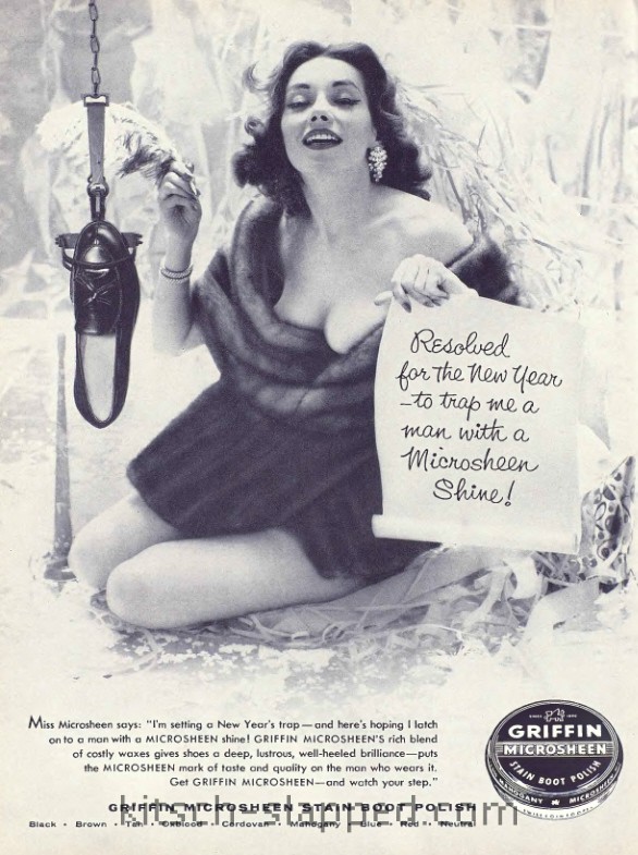
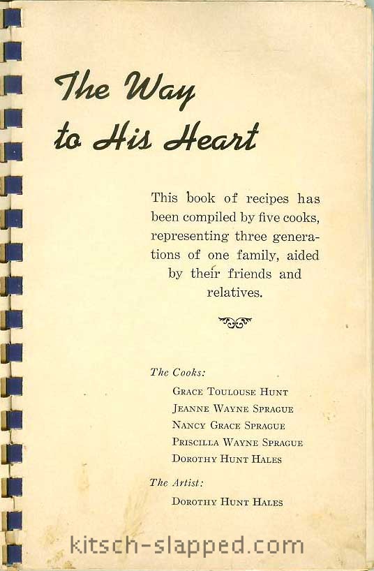
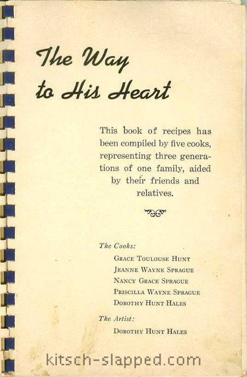
This is the cover of The Way To His Heart “A Cookbook with a Personality”, 1941; note the figures on the cover.

the way to his heart vintage

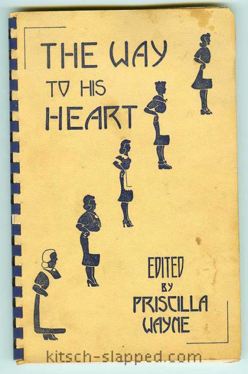
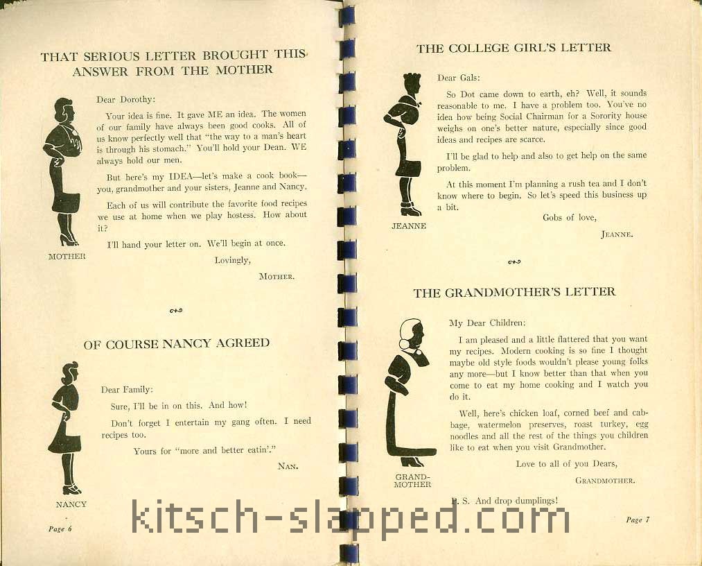
The five female figures on the cover of this vintage cookbook depict the five cooks featured in the book itself. These five women are said to be three generations of one family. From the bottom left working our way to the top right are “Grandmother” Grace Toulouse Hunt, “Mother” Priscilla Wayne Sprague, “Newly Married Daughter” Dorothy Hunt Hales, “Collegiate Daughter” Jeanne Wayne Sprague, and “Teenage Daughter” Nancy Grace Sprague.

While I can admit to certain body changes in terms of aging, I find the rounding of age in proportion to hem length somewhat amusing… Not only is Grandma rather stout, but combined with her nearly floor-length dress she closely resembles a Russian nesting doll. And notice how only newly married Dorothy has curves in all the right places — illustrating her appropriate fertility status. (Heck, her proportions make me want to ask the new wife when she’s going to have a baby!) Perhaps even more amazing, this illustrated figure study of body image stereotypes is the artwork of one of these women; at least Dorothy “Dot” Hunt Hales is the artist credited. (More on that later.)

way to his heart author and artist credits

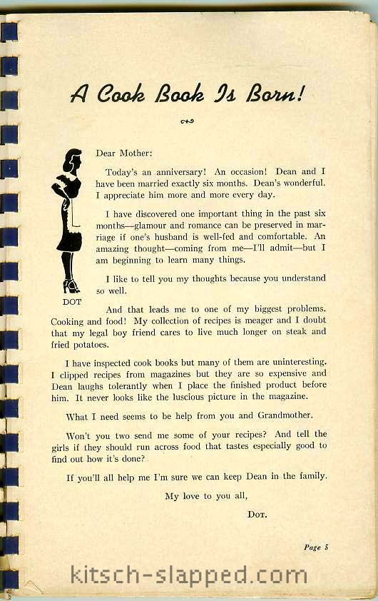
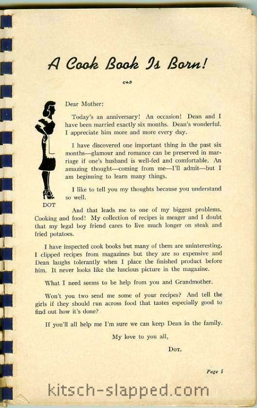
The story or “personality” behind this cookbook is that newlywed Dot writes home to her mother asking for some recipes. The occasion is the wonderful celebration of their 6 month wedding anniversary and the young bride has learned how important cooking and food is to her marriage:

I have discovered one important thing in the past six months — glamour and romance can be preserved in marriage if one’s husband is well-fed and comfortable.

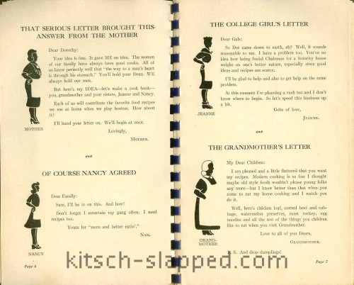
Mother is, of course, no doubt delighted her daughter has seen the light and become a believer in the old adage that the way to a man’s heart is through his stomach. Not only is mom thrilled to help her wise and dutiful newly married daughter Dot, but mom enlists the help of Dot’s grandmother and sisters. These are their “letters” from the front of the vintage book:

etsyscans10-30-13013

etsyscans10-30-13014

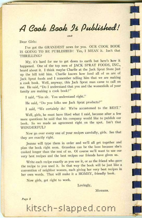
And then, the most amazing thing happens! “One of the top men of Jack Sprat Foods, Inc., heard about it” and they decided to publish the cookbook! Enter Western Grocer Company, owner of the food brand, as publisher; enter the advertisements for Jack Sprat brand foods.

etsyscans10-30-13015

While the “homey, friendly” premise seems rather contrived to the jaded consumers of today (and the corporate ads themselves also draw into question Dot’s artwork), the book’s editor, Priscilla Wayne Sprague appears to be an actual author. But the proposed family relationships get a bit confusing…. My research continues and shall be reported soon. (Watch this space.)

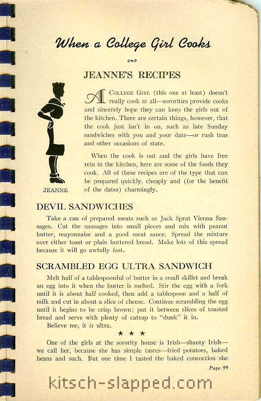
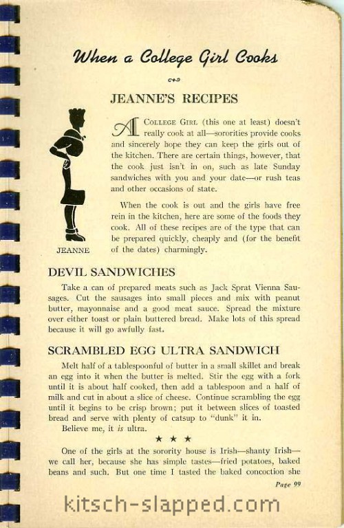
I also have to share some information from the vintage cookbook’s section by college daughter Jeanne. Jeanne’s appearance certainly tones down any sex appeal, and we are likely to suppose any fears about daughters in college along with it. And even if such imagery might lend itself to jokes about college girl experimentation and stereotypical lesbian dress, the experimentation in the kitchen appears to have been limited — at least for sorority girls.

A College Girl (this one at least) doesn’t really cook at all — sororities provide cooks and sincerely hope they can keep the girls out of the kitchen. There are certain things, however, that the cook just isn’t in on, such as late Sunday sandwiches with you and your date — or rush teas and other occasions of state.

When the cook is out and the girls have free rein in the kitchen, here are some of the foods they can cook. All of these recipes are of the type that can be prepared quickly, cheaply and (for the benefit of the dates) charmingly.

Oh, how can poor Jeanne ever get her M.R.S. degree if she doesn’t cook?!

when a college girl cooks

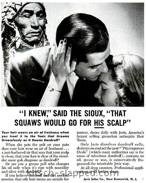
This vintage book from 1941 has some of the racism you might expect from the 1930s and 40s. At the bottom of the page, Jeanne starts a story which continues on the next page:

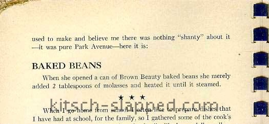
One of the girls at the sorority house is Irish — shanty Irish — we call her, because she has simple tastes — fried potatoes, baked beans and such. But one time I tasted the baked concoction she used to make and believe me there was nothing “shanty” about it — it was pure Park Avenue — here it is:

vintage shanty irish baked beans

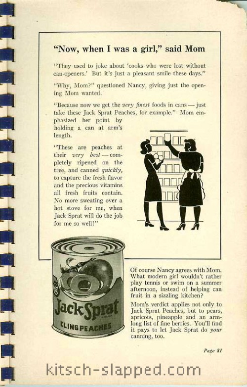
It is recipes like this one, based on canned goods, which certainly marks a change (if not decline) in cooking itself. This turning point in American history turns out to be a good thing for Jack Sprat Foods, Inc. and the Western Grocer Company. The grocery store addresses this issue in one of the advertisements for the Jack Sprat brand:

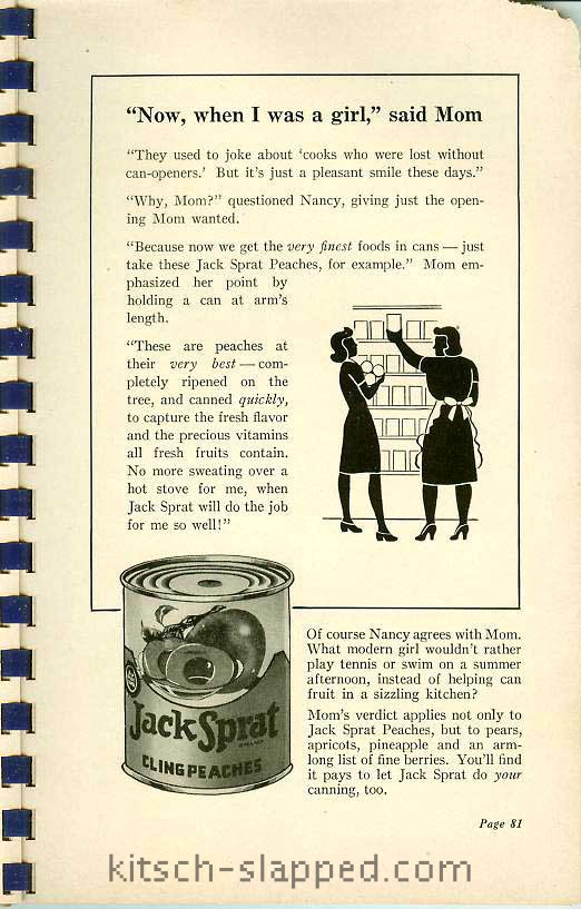
“Now, when I was a girl,” said Mom

“They used to joke about ‘cooks who were lost without can-openers.’ But it’s just a pleasant smile these days.”

“Why, Mom?” questioned Nancy, giving just the opening Mom wanted.

“Because now we get the very finest foods in cans — just take these Jack Sprat Peaches, for example.” Mom emphasized her point by holding a can at arm’s length.

“These are peaches at their very best — completely ripened on the tree, and canned quickly, to capture the fresh flavor and the precious vitamins all fresh fruits contain. No more sweating over a hot stove for me, when Jack Sprat will do the job for me so well!”

Of course Nancy agrees with Mom. What modern girl wouldn’t rather play tennis or swim on a summer afternoon, instead of helping can fruit in a sizzling kitchen?

Mom’s verdict applies not only to Jack Sprat Peaches, but to pears, apricots, pineapple, and an arm-long list of fine berries. You’ll find it pays to let Jack Sprat do your canning too.

jack sprat canned food cooking jokes

If the convenience of modern canned foods was the advent of more free time for girls and women, perhaps it can be linked not only to the decline in cooking skills but to the decline in the “way to a man’s heart” adage. Men such as Barry Popik say this approach works for dogs and not men; however ironic the dog reference may seem to me, Popik seems to be saying this food-as-lure lore doesn’t work. Also, men at AskMen no longer find cooking on their top list of skills necessary in a female partner. Enlightenment reaches us, maybe? Would that such enlightenment about female body images would change as well.

Ah, The Chick’s An Old Battle Ax

The “new woman” rode bicycles — and she smoked and likely even chewed tobaccie. So it makes sense that folks would advertise tobacco directly to her. In this antique tobacco ad, the angel of morality and the home is to be sold on the idea of getting said tobacco for her man — but it’s difficult not to find the “Battle Ax” name sending yet another message about how she should stop bitching about the gentleman’s use of tobacco products. Ad via my husband’s website, Dakota Death Trip.

“The New Woman”

Battle Ax Plug

A Great Big Piece For 10 Cents

The “new woman” favors economy and she always buys “Battle Ax” for her sweetheart. She knows that a 5-cent piece of “Battle Ax” is nearly twice as large as a 10-cent piece of other high grade brands. Try it yourself and you will see why “Battle Ax” is such a popular favorite all over the United States.

Antique_Battle_Ax_Tobacco_Ad

Whatjamacallits Wednesday: Tigers In Your Tank Edition

Back when I was a kid and I didn’t understand intellectual property such as sales & marketing slogans; hence, I never understood why Kellogg’s didn’t just come right out and have Tony The Tiger say that Frosted Flakes cereal was the tiger in your own tank. I was reminded of this upon sight of this vintage Tony The Tiger stuffed toy.

To me, a tiger was a tiger — and really just as cute. (Don’t you just love the Exxon tiger on this glass pitcher?)

And fuel was fuel, even if cars had less “taste” to worry about.

I sill feel rather the same way today about both tigers and fuel. Even with a better understanding of slogans, marketing, and intellectual property. That knowledge, combined with my usual obsessive streak, has since led to the discovery that it was Kellogg’s who first unleashed their tiger (in 1951). Exxon’s tiger arrived in 1959. So perhaps it was Exxon executives who ate cereal and felt the connection between breakfast fuel and gasoline for cars.

Both of these item are for sale. I am an antiques dealer, you know. (Also on Facebook.) You may also contact me about them, if you are interested.

I Bet You Think I’ll Hate This

But I actually quite like this vintage Scandale lingerie advertisement with artwork by Edmond Kiraz.

Impossibly long legs don’t bother me — when they are part of fashion illustration. As Slip of a Girl writes, “Illustrated ads do not run the risk of starting or perpetuating body dysmorphia or forms of self-hating body loathing because we know they are illustrations — no one looks like that. But we can pretend to…”

The female depicted as feline, while cliche, isn’t a real bother either; women have relationships with cats, like it or not.

But perhaps the best thing about this vintage ad is what I learned: Kiraz made dolls. Fashion dolls based on the artist’s Les Parisiennes series, to be precise. What Kiraz himself calls the “effigies of his work made by Birgé-Jopo”.

Often called Poupee de Kiraz or Les Parisiennes dolls by Kiraz, these 15 inch tall French fashion dolls seem to have only been made for one year, in 1967. That makes these little gems difficult to find. And playing hard-to-get does so turn me on as a collector. I am now on the look-out for these vintage vinyl fashion dolls from France. The ones with the round faces, cat’s eyes, and impossibly long and slim legs. So period. So fascinating.

All images via GGSDolls.

Vintage Political Trick Or Treat

The Mondale-Ferraro campaign used the Halloween “Trick Or Treat” theme to get some votes in the bag:

Trick:

For those with under
$10,000 a year,
23 Billion LESS!

or

Treat:

For those with over
$80,000 a year,
35 Billion MORE!

(These are the Congressional
Budget Office projections
for the years ’83, ’84, ’85)

If these figures SPOOK you

Vote Mondale-Ferraro for America

The Power Of The Female Voice In Silent Film

Over at (one of his) sites, Dakota Death Trip, hubby posted this fabulous old ad. While you might think it’s an advertisement for a woman, Clara Kimball Young, it really is promoting a film, 1920’s The Forbidden Woman (not to be confused with 1948’s Forbidden Women, which allegedly stars women recruited from a Los Angeles whorehouse).

Why is Clara Kimball Young such a focal point? Because back in the day, women ruled the box office!

As I wrote in my review of Mick LaSalle’s Complicated Women: Sex and Power in Pre-Code Hollywood (my review is fine, but NWS ads in sidebar):

In the 20’s and early 30‘s women dominated at the box office. Women were the biggest stars, featured month after month on the covers of fan magazines (it was a rare month indeed when a male face turned up on the cover!), and society was fascinated with women in general.

If you’re curious about the historical role of women in and out of film, how they once held all the power and how it was taken from them, read LaSalle’s book.  And then read Movie-Struck Girls: Women & Motion Picture Culture After the Nickelodeon, by Shelley Stamp. (Here’s my review.)

Also related, my post on female celebrity pitch women at the turn of the (last) century: Julia Marlowe, Selling Stuff From Head To Toe.

For Sexists Sans Secretaries

For men who, unlike the Mad Men, didn’t have their own private secretaries to humiliate and fondle, there was Ellen the Eye Opener:

Yes, sir! When there’s a job to be done, a service to perform, or a need to be met, we’re ready for action. And when it’s time for a smile, we like to erase those frown lines with something on the light side, for all work and no play makes Jack a dull boy.

So… meet Ellen, the Eye Opener, a girl who’ll appeal to your “mail” instincts… as she opens your mail, let her serve to remind you of us. Treat her nice… she’s a swell gal.

From the seller’s description:

[A] Gil Elvgren designed plastic letter opener entitled “Here’s an Eye Opener” produced by Brown & Bigelow between 1958-1960, including the original sleeve on card stock. This fun 3D letter opener, with a flat back,is done in “accurate” curvy detail, and is in very fine condition, as pictured, and measures 8.5″ x 2.5″ at it’s widest point. The folding sleeve which creatively ‘undresses’ Ellen our pin-up model measures 8.5″ x 7.25 opened, is in excellent shape with no tears or visible toning.

The medallion she is holding above her head would have had the name of an individual business – in this case from “Mannequin Service Company – Saint Paul MN” – used as customer giveaways.

All images via Grapefruit Moon Gallery.

Sex Sells… Swans

A recent study may have found an increase in ads using sex to sell, but using sex to sell has been around a long long time. Perhaps the study didn’t go back far enough? The study looked at 30 years of magazines, but this promotion for Pliofilm, featuring a sexy nude woman behind the see-through Pliofilm shower curtain decorated with swans and flowers, was published in the 1930s. Which begs the question… Who the hell was this targeting — men or women?

Ye Olde Comfort Hip Corset Truly Chaffes

An antique advertising or trade card for the “Comfort Hip” corset by Helm, Snorf & Watson of North Manchester, Indiana.

I’m not sure if we’re supposed to sing it… But this is how the sales “poetry” reads:

How dear to my heart is the “Comfort Hip” Corset,
A well moulded figure ’twas made to adorn,
I’m sure, as an elegant, close fitting corset,
It lays over all make I ever have worn.
Oh, my! with delight it is driving me crazy,
The feelings that thrill me no language can tell;
Just look at its shape, — oh, ain’t it a daisy!
The “Comfort Hip” corset that fits me so well.
The close fitting corset — the “Lock Claso” corset–
The “Comfort Hip” corset that fits me so well.

It clings to my waist to tightly and neatly,
Its fair rounded shape shows no wrinkle or fold;
It fits this plump figure of mine as completely
As if I’d been melted and poured in its mould.
How fertile the mind that was moved to design it,
Such a comfort pervades each depression and swell,
The waist would entice a strong arm to entwine it,–
The waist of this corset that fits me so well.
The close fitting corset,–the “Lock Clasp” corset–
The “comfort Hip” corset that fits me so well.

Of course I will wear it to parties and dances,
And gentlemen there will my figure admire!
The ladies will throw me envious glances,
And that’s just the state of affairs I desire;
For feminine envy and male admiration
Proclaim that their object’s considered a belle.
Oh, thou art of beauty — the fair consummation —
My “Comfort Hip” corset that fits me so well.
The Five-Hook corset — the “Lock Clasp” corset–
The “Comfort Hip” corset that fits me so well.

If this is to be sung, the reason I cannot sing along isn’t because I don’t know the melody; the phrase about desiring “feminine envy and male admiration” coupled with referring to one’s self as an object makes me gag.

“Look Like A Chick For A Change”

An ad promoting more “feminine” fashions found in a 1974 issue of 19 magazine. Because, you know, ladies dasn’t wear pants.

Diana Pooley Ltd. must have been like Laura Ashley was in the 1980s; the option for “non-feminists” who eschewed being anything other than a lady in a man’s world. Fashion choice is one thing, but forcing such gender ties to fashion… Well, I often wonder if the Pooleys and Ashleys of the world are ever embarrassed to see their old ads.

Vintage ad scan found at Emmapeelpants at Flickr, where she calls it “Brilliantly patronising and rude.”

Filter, Flavor, Color Too With Glamorous Vanity Fair Cigarettes

Ahh, the great marketing movement of making things pink to sell them to women… This time, ladies, turn in your pink lungs for pink smokes.

Also available in pastel blue, for that oxygen deprived look.

According to Behind The Smoke on Flickr, the Vanity Fair cigarettes were only around for five years, at which point they were replaced by the Vogue Color cigarettes, which contained an assortment of five colors.

Beauty After The Atomic Bomb?

Advertising based on fears — especially the female fears of beauty, “catching” and “keeping” a man — are nothing new. This vintage print ad for Dorothy Gray captures those horrors.

However, this vintage TV commercial for a pre-cold war cold cream preys on more than beauty fears. Circa the 1950s, this commercial for Dorothy Gray Cosmetics boasts how the cleanser removes two and a 1/2 times the radiation of other cleansers. No word on how much radiation is left behind or even it it’s enough to kill you…

Vintage Jay Herbert

On a recent visit to Fargo’s Antiques On Broadway, I spotted this vintage lighter (still in the box) advertising Jay Herbert of California and the stylized name looked familiar…

A quick image search on Google, and I received the instant gratification I sought: vintage fashion labels for Jay Herbert of California.

My favorite is this fancier version in which the scroll work at the bottom somehow remind me of scissors. It still holds it’s logo value today, for somehow, in all my perusals of vintage fashions over the years, I retained the sight of it enough to recognize it on the lighter.

If I had to guess, I’d say the fancier labels are the older ones. But it would only be a guess. For aside from department store ads in old newspapers announcing the Jay Herbert of California brand, there’s scant information available on the fashion house.

One thing is for certain, though: Jay Herbert was not a fashion designer or even an actual person. Buried in a precedent setting legal case regarding the definition of an employee (at least for tax purposes), I discovered that Jay Herbert of California was the business name of partners Herbert Owen and Joseph Silverstein who “engaged in the manufacture and sale of ladies’ dresses” in 1960.

That technically means that references to Jay Herbert as a designer are false.

But there’s even more ambiguity…

It appears that Jay Herbert of California began appearing in vintage department store advertisements in the late 1950s but by the mid 1960s they fade away… And decades later, in the 1980s, the name Jay Herbert appears again — on handbags and wine caddies — but now simply as Jay Herbert, New York.

I’m rather smitten with this vintage or retro Jay Herbert New York handbag.

I’m not sure if this Jay Herbert, most known for their coveted quilted Chanel-inspired handbags, is related past anything but name. Trademark searches show no records for the name Jay Herbert, Jay Herbert of California, or Jay Herbert New York. The name could have been sold, licensed, or, having no protections, even just capitalized upon as having some recognition with retailers.

More contemporary handbags appear with metal tags bearing the Jay Herbert name and metal “coin” logos — but these handbags and purses are “by Sharif.”

Sharif, like Cher, uses only one name. The designer bags are sold mainly (if not only) on HSN. The designer incorporated as Sharif Designs Inc. in 1979, but it has a family history dates back to 1827 in Egypt.

Personally, I prefer the vintage bags over the new ones, and the vintage fashions even more. But it’s the vintage labels and logos I love most of all.

I hope this helps you with your Jay Herbert shopping and collecting. If you can add any information, please do!

Image Credits: Simple Jay Herbert of California label via Half A Second Art and Vintage; fancy Jay Herbert label via Timeless Vixen Vintage; Jay Herbert New York purse label via Barefoot & Vintage; Jay Herbert New York wine caddy label via DJVintage; retro quilted Jay Herbert purse via A Little Luxury; two photos of Jay Herbert by Sharif metal tags via Mr. Mister Vintage